Search Node View, Filter, Group, Sort, and Display Options | Query Builder Series #2
Tana Query Builder Series #2 Update 2024 Beta Version
We continue the Tana Query Builder Series for beginners. In this edition, we begin to explore the Search node name and the node’s search, view, and display options: the area shown in section #1 in the diagram below. Future editions will cover the other parts.
The entire Query Builder Series Index:
Thank you for your continued support. I'm on a mission to help the less tech-savvy community enjoy Tana's power. Your questions are always welcome in SLACK (here’s a Slack invite), in our exclusive Substack subscribers-only Chat (including free subscribers), or DM me in SLACK or Twitter.
TABLE OF CONTENTS for
2023.06.15 | v.20 | web.318.0 Beta
Search Node Name
Search Options
View Options
View As
List View
Table View
Card View
Calendar View
Tab
Side Menu
Save as New
Show applied filters and options
View Options
Filter
Group
Sort
Display
Discard all View Options
Resources
Emoji conventions used in this series:
👀 The “eyes” emoji highlights additional information, something interesting, or another application you might not have considered
⛔️ The “warning” emoji, wait for it… warns you where beginners might trip up. The warning can be something you want to avoid doing or something good (or bad) that beginners often miss
✅ Indicates advantages
❌ Indicates disadvantages
✅❌ Indicates it could be pro or con depending on your perspective
🐛 Potential bug (in my opinion)
📝 Click-by-click instructions
🤷♀️ Frequently asked questions by beginners
Let’s Deconstruct Search Node Search and View Options
The Search Node Name
Depending on the method you use to create the search node, the default name for the search node will either:
represent options you selected as you clicked through the query builder via CMD+k>Find Nodes…
default to “Unnamed search node“
default to the name of the node duplicated, referenced, or entered
You can delete the default name and type something meaningful to you. This name can be changed at any time and will automatically update any references to the search node and the search itself.
⛔️ Don't delete the node by mistake. You only want to delete the title - so highlight just the words in the title and press delete or backspace through the title name.
Search Options
The icon for search options appears in two different forms. Both bring up the same drop-down box, as shown below
Search Options Builder Editor box is open:
And one for when the Query Builder Editor box is closed:
Clicking on either Icon displays the Search Option drop-down box:
Only the last item is clickable: Open query editor. The other two lines are informational only.
👀 Clicking on the wavy line icon (which only shows when the Query Builder editor box is open) really doesn’t make sense. But you can click on it, and it shows you the drop-down above. Like the dot icon above, the only actionable item is to open the query editor—which, in this case, is already open.
View Types
A View type determines how your nodes are rendered. You can look at the same set of nodes (set up as a parent node with children) as a list, in table format, as cards, in a calendar, as a side menu, or as tabs.
Selecting the View Options icon displays the View Options drop-down box.
This section provides basic information on view options, plenty to get you effectively using these options every day. There are, however, many options within each view option that are explored in a different article.
Each option is deconstructed below.
View As
displays another drop-down:
This drop-down has four View options: List, Table, Cards, and Calendar.
And two Navigation Views: Tabs and Side menu
List view
displays search results as a list:
Table View
displays search results in a table format:
Card View
displays the search results in the form of cards:
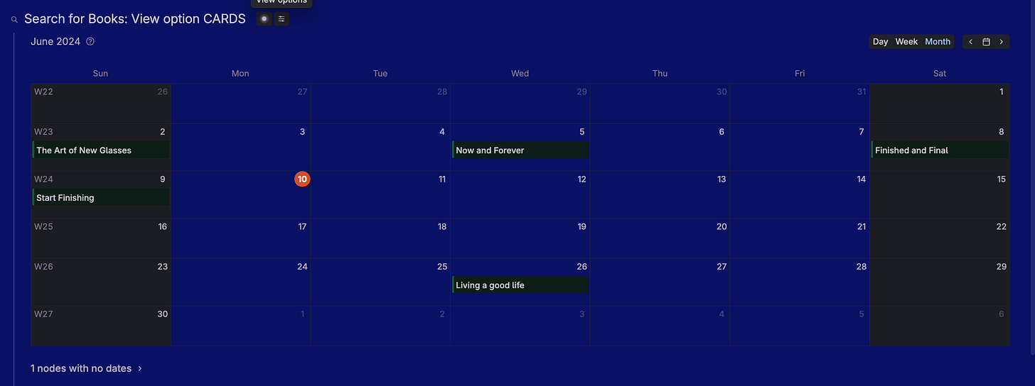
Calendar View
displays the search results on a calendar:
⛔️ Calendar view requires the search result nodes to have a Date Field. Tana then uses this user-defined date field to determine in which date box to place the search result node. If you have more than one date field in the supertag - you can choose which one or ones to include via the Display option drop-down (see below).
Tabs
displays each search result node as a tab horizontally across the top of the node. As you click on each tab, the resulting detail shows below it.
👀 Since most searches result in more results than feasible for Tab view, Tab view is generally not used in search nodes. Rather than a view type (as are the views above), Tab view is considered a navigation view. A great use case for Tabs is a dashboard, and they are often seen in #day tags.
Side Menu
is another navigation view. Side Menu flips Tab view and puts the “tabs” vertically on the side.
👀 Side Menu, too, is not usually used with search nodes and is more often used for dashboard-type presentations.
Save as new
This saves the search, along with any set view options, as a new search, and it switches the view to tab view.
🐛 I’m not convinced switching the view type is as designed, so it may change in the future, but for now, it is what it does. It also deletes your node name of the original node (I think this, too, is a bug and has been reported). In addition, in the original node (after saving as new), the indications that a filter is active are missing. This, too, has been reported and may be a bug or just in need of a better user experience.
Images below show the node before the “Save as New” was selected, and then after.
⛔️ “Save as new” is greyed out until you use the Filter option on the node.
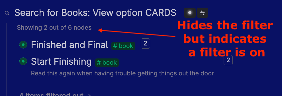
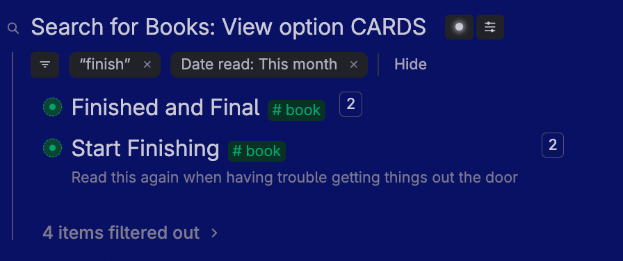
Show/Hide Applied Filters and Options
This is a toggle. You can choose whether you want the applied filters and options to show or not. In the images below, the search looks for all nodes tagged #book and only those with the word “finish” in the title (filter).
Showing them looks like this:
Hiding the applied filter and options looks like this:
View Options
View options include Filter, Group, Sort, and Display. These options can be applied to one or more view types. Here is a summary of which view options can be used with which view types.
Below we deconstruct each view option.
Filter
limits your search results. Think of this as a search within the original search results. Select Filter from the View options, and the Filter drop-down box appears.
You can filter by any one or combination of the items in the drop-down.
👀 To have more than one filter, you must add the first one. After that, the system returns you to the search node, where you must select the FILTER option again and select the next filter. All filter options stay until you click the “x” next to them to delete that specific filter.
👀 Filter feature is available on all view types.
Here is a search node with multiple filters. Note “Show applied filters and options” in ON.
Group
displays search results separated by user-selected field values.
When using this option, think GROUP-BY. When selecting GROUP, it includes a list of fields (see first image below).
Once you select the field you want to group by, Tana will show all the field values upon which it will group.
You can uncheck any values you don’t want shown.
When you first use this GROUP feature for a specific field, the SHOW options will all be selected by default (as shown above).
However, if a field value (Rating) is added after you perform a Group view, it will not automatically be checked.
The image above demonstrates that a rating of “7” was added after the Group option was selected and thus was not included in the output. If you add new values often, get in the habit of checking the group show options each time you run the search so that you’re not missing information.
🐛 Be aware if you add a new value in the group field (in this example), you must manually update your Group show selections.
⛔️ Another thing that can easily trip up beginners— be sure to enter your values from the field value drop-down after tagging a node. If you don’t, you’ll end up creating new nodes. For example, in the image below - there are two - rating 1 categories - one at the top and one at the bottom (which is empty).
This is because when entering the rating for the first book, the “1” was entered by selecting it from the drop-down, and for the other book, the “1” was entered by bypassing the drop-down (press ESC) and just entering a “1.” If you look closely you can see it in the expanded nodes below.
I can’t explain why it puts both books in the top category, and none in the second number 1 rating group (shown last) and that it still shows both number 1 rating groups. That’s a mystery. To avoid this - just always select from the fields drop-down.
⛔️ …and we’re not done with the oddities in Group. If you have multiple values in your group field (in any instance), it will show the node in the group related to only the first value (of the multi-valued field).
🐛 Be aware if you have multiple entries in your group-by field, the node will appear in the group for only the first entry. In the example below, the book “Now and Forever” is written by Joe Dobbs and Jane Smith. However, when the search is grouped-by AUTHOR, the book only appears under Joe Dobbs, as he is listed first in the Author field.
⛔️ Understand that multiple values, when using group, are ignored - Group will only use the first value.
⛔️ Another potential bug 🐛 (but some say it’s by design). In the image below, the Rating #3 group appears, but it has no items in it. Although this is technically correct, as there are no books with the rating “3,” I would prefer to choose whether to show blank groups or not.
For example, you might be classifying a clothing inventory. You might have a gender-neutral shirt (think sweatshirt). Thus, in your category field for the sweatshirt you have both men’s clothing and women’s clothing because it applies to both categories. If you did a group view of your inventory - the node sweatshirt will appear only under men’s clothing. So if someone comes along to see what inventory items for “Women’s clothing” are in stock - it won’t show sweatshirts — I feel that’s misleading. In my opinion, it’s a bug 🐛, but others say it’s by design. It has been requested to allow an option to show in both places.
⛔️ … one last thing. As you can see from all the screenshots above, the visual appearance of group results is unappealing to the eye and even difficult to read. there are no “headings” or any visual differences for the group titles or separation between the groups.
For the reasons outlined in this section, I don’t find the Group option very useful at this time. I believe it has tremendous potential but currently has too many potential bugs in it to be effective. I sure hope the Group option gets some love soon!
👀 Group feature is only available for List and Card views.
Sort
sorts the search results by the user-selected field.
When you select sort, you’ll get a sort popup box.
Select “Add sort” and you’ll get a list of fields by which you can sort. These include user-defined fields as well as system fields:
Select one field (at a time) to sort by. You can have multiple sorts. Say you want to sort by Author and with Author by node. You can. But you must select them one at a time, using the “Add Sort” button in between.
If you are in list, table, or card view, the sort will apply to your entire list. In Group view, it will sort each item within a group.
⛔️ Note if you’re in Tab or Side menu view - there is NO sort option. This is because they are navigation views. If you want to change the order of the tabs - you can drag and drop them into your preferred order, or you can revert back to the list view- sort there — then change back to the tab or side menu view
👀 Sort is only available on List, Table, and Card view
Display
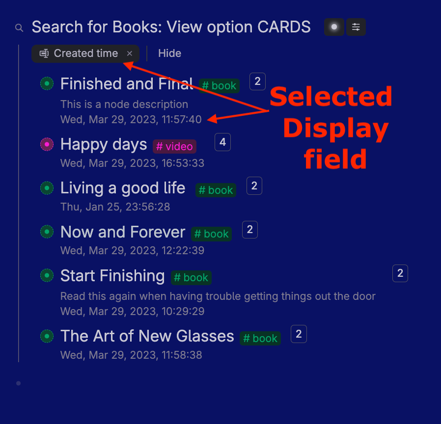
The DISPLAY option allows you to select the information you want to be shown in addition to the node name. From the DISPLAY dropdown, select which fields you want to show.
From here, select the items you want to display.
How the item is selected depends on your view option. See examples of each below:
In list view, the selected display field will show directly beneath the node or beneath the node description (if any).
In the Table view, the selected display field will show as a table column.
⛔️ Note: if you switch from list view to table view, the display options do not carry over. So, select Display again, and click and unclick the options you want.
In Card view, the selected display field shows at the bottom of the card:
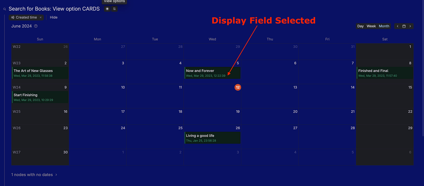
In Calendar view, the selected display field shows at the bottom of each calendar entry:
👀 Display is available only on List, Table, Card, and Calendar View. There is no Display option for navigation views: Tabs and Side Menu.
Discard all view options
erases all view options you might have set.
The search node Search and View options are one of Tana’s superpowers. They enable you to see a group of nodes in different ways without the need for an add-in or any coding. With one click, you can see the info as a list, in tabs (horizontally or vertically), as a table, as cards, or in a calendar, as tabs or side menu. How cool is that!

